Tips from the google Adsense optimization specialist (For those who have missed it).

Even though most of you must have read this in the google adsense blog or at some other blogs, these tips I came across I found to be very informative and wanted to share with some of my readers who might not have come across this.
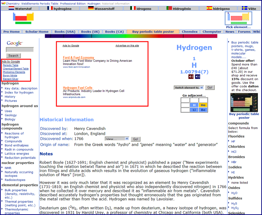
To start with what amazed me was the story of a website who turned their adsense earnings around from $10/day to $1700/day in a matter of few days just by changing the adsense layout. This goes onto show how choosing the proper lay out and blending it properly to go with the design of the site prompts more visitors to click on them. It is a great psychological factor. The sites name is webelements.com and here is a snap shot of
the site with the adsense layout that revoltionized their adsense earnings. They found success by adding link units to each page of their site, placing Large Rectangles directly before and after their content, and adding a Wide Skycraper to their left sidebar. I guess this site must have already been having a pretty good traffic and just that the visitors were not clicking on the ads since they were poorly placed before the changes they made.
In the words of the google adsense optimization specialist Ivan Heneghan "They were using a 468x60 Banner at the bottom of their pages, but started experimenting with two 300 x 250 Medium Rectangles -- one placed just at the top of their content, and another placed directly under the main content on each page. They also tried using more blended colours. Things went crazy from there and earnings shot up to $700 per day. Finally, they moved one of the 300x250 Rectangles from the top of their page to a location more embedded in their content. After that, earnings went to over $1,700 per day!"
Ivan also gives his top three tips. They are:
1. Use wide ad formats. Many publishers find the 728x90 Leaderboard outperforms the 468x60 banner by about 70%. I particularly recommend using the 728x90 Leaderboard, 160x600 Wide Skyscraper, and 300x250 Medium Rectangle.
2. Embed Google ads in your content, and place Google ads at the end of your articles, news stories and reviews. Placing a 468x60 Banner in the typical slot at the top of page, or a 120x600 Skyscraper along the right-hand side of page, work well for cost-per-thousand impressions (CPM) ads. However, for cost-per-click (CPC) contextual advertising, AdSense tends to work best when integrated with your content.
3. Blend your ad colours into your website. After running a test with a bright pink 728x90 Leaderboard on a black background, I learned that complementary colours often work better. Try blending the background and borders of your ads into your site, and use a text colour that stands out but already exists on your site. Blending decreases ad blindness and users are more likely to notice ads that interest them.
Source 1
source 2
Link to google's adsense optimization page.
(I mentioned about this here in my blog for the sake of those readers who might have missed this one and I hope it helps them)

2 comments:
I followed similar suggestions, my CTR went up, I was happy.
One week later I was hit by smartprice :(
Oh man sorry to hear that. Hope it will pick up back really soon. May be try something different? What is your site name btw?
Post a Comment